Brief
Dubai Islamic Bank
New Brandmark
Pioneer of Islamic Banking | Largest in the UAE | 40-year heritage | Expanding international presence | Re-branding
THE METHOD
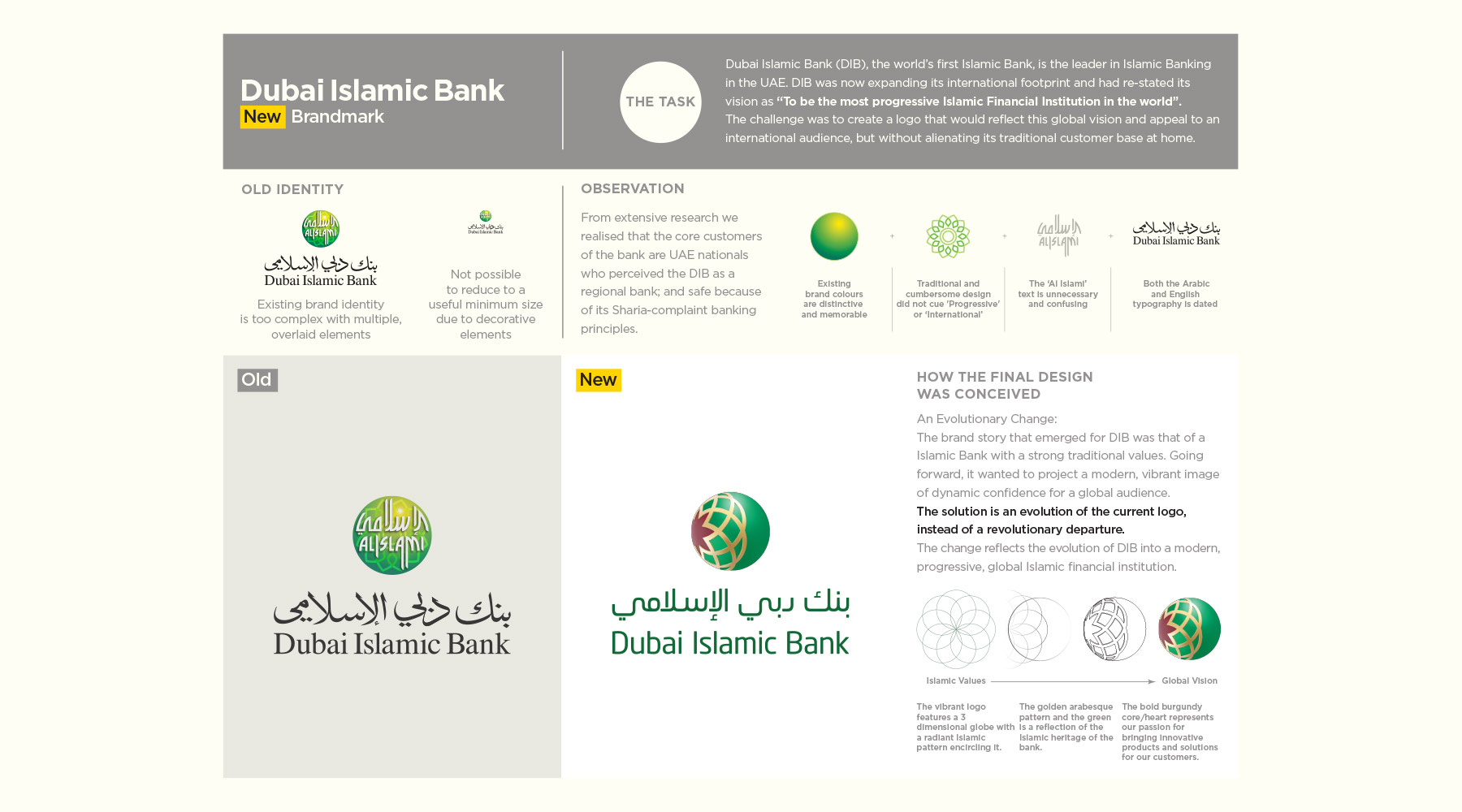
From extensive research we realised that the core customers of the bank are UAE nationals who perceived the DIB as a regional bank; and safe because of its Sharia-complaint banking principles. Other critical pointers derived from the research were:
• Existing brand identity is too complex with multiple, overlaid elements.
• The ‘Al Islami’ text is unnecessary and confusing.
• Traditional and cumbersome design did not cue ‘Progressive’ or ‘International’.
• Both the Arabic and English typography is dated.
• Not possible to reduce to a useful minimum size due to decorative elements.
• Existing brand colours are distinctive and memorable.
THE TRANSFORMATION
An Evolutionary Change The brand story that emerged for DIB was that of a Islamic Bank with a strong traditional values. Going forward, it wanted to project a modern, vibrant image of dynamic confidence for a global audience. The solution is an evolution of the current logo, instead of a revolutionary departure. The change reflects the evolution of DIB into a modern, progressive, global Islamic financial institution.
THE RESULT
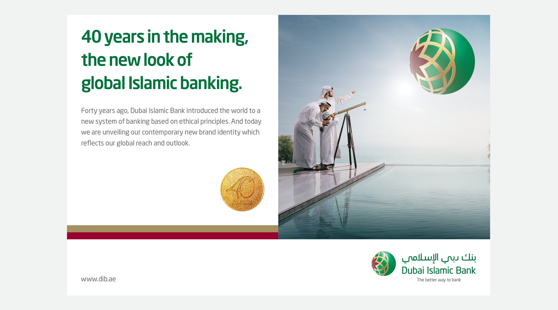
The rebranding exercise helped Damac to consolidate its positioning as a luxury brand. The brand structure also allowed the brand owners to position each individual property in the right manner. HH Shaikh Mohammed bin Rashid Al Makhtoum, Vice President and Prime Minister of the UAE and Ruler of Dubai, unveiled DIB’s new logo and brand identity at the 40th Anniversary celebration of the bankextending its international presence with a new, contemporary and vibrant brand identity. The new logo and brand identity has been introduced across multiple communication mediums including social media. A full set of design and usage guidelines have been created for DIB and all its sub-brands (segments) thus establishing a uniform brand face and architecture. DIB is extending its international presence with a new, contemporary and vibrant brand identity.
Services Provided:
- Art Direction
- Content English/Arabic
- Design
- Digital Film
- Marketing
- Photography
- Production
- Strategy
